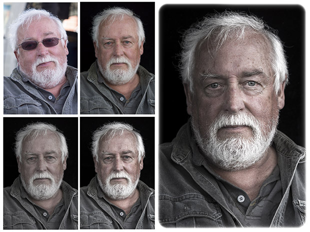
A while back I was visiting a local market and photographed one of the stall holders riding a children’s tricycle he had for sale. A month or so later I returned to give him a print of the photo. In the meantime, his mate Alan asked me why I hadn’t taken his picture (one opportunity leads to another). I duly began shooting with my ‘go-everywhere’ camera – a Sony NEX7 with a 50mm f/1.8 lens. My first photo, taken at 10.40.29 (according to the camera’s EXIF data) was not great. The sunlit van in the background, Alan’s laid-back posture and his sunglasses were not conducive to making good portraits.
I asked my partner to hold up a black cloth (a velvet-like material that acts like a light-sponge) behind Alan then asked him to remove his sunglasses. As the glasses were removed he sat more upright. I checked the aperture was set to f/2.8, used the magnified view in focus assist to lock the focus precisely on his eyes and took a second picture at 10.40.52. I adjusted the framing to vertical, moved closer, checked the focus again and fired the third image at 10:41:07 (38 seconds had elapsed since the first ‘snap’). This was my favourite of the images and the one we will process in the following project.
01 DOWNLOAD
First, go to our image download page [http://www.australianphotography.com/how-to/tutorial-images] and download the start image. (Make sure you read the instructions for downloading the image as it is a raw file and is a little trickier to download than a standard JPEG). Take note of where the image is saved on your desktop.
02 IMPORT PROJECT IMAGE
Open Lightroom and in the main menu go to File > Import Photos and Video. (Note: You need to be in the Library module to import images.) Find the project image, make sure it’s ticked, and click the Import button. (If there are other images in the same location that you don’t want to import, first click the Uncheck All button then tick the box above the project image.)
03 CROP AND STRAIGHTEN
Go to the Develop module and click the Crop Overlay icon below the histogram. Slide the Angle slider to just shy of 6 degrees, or alternatively you can rotate the crop box by placing your mouse below the bottom right-hand corner handle and dragging the image straight. You will also need to move the corners in to centre the man in the frame.
04 WHITE POINT AND EXPOSURE
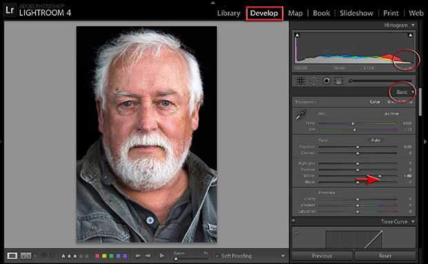
Go to the Basic panel in the Develop module and raise the Whites slider to a value of +60 to expand the tonal range of the image. (Check the histogram as you go to make sure that the highlights aren’t clipped – if they are the graph will start to bunch up on the right.)
05 SET TONE AND PRESENCE
In this step we will adjust Tone and Presence to enhance the character of the face. Move the Highlights slider to -40 to ensure the white hair has maximum detail. Now, increase the Clarity slider to +10 and reduce the Vibrance slider to -60. This last adjustment increases detail at the cost of colour accuracy, though I like the effect in this case.
06 SET BLACKS
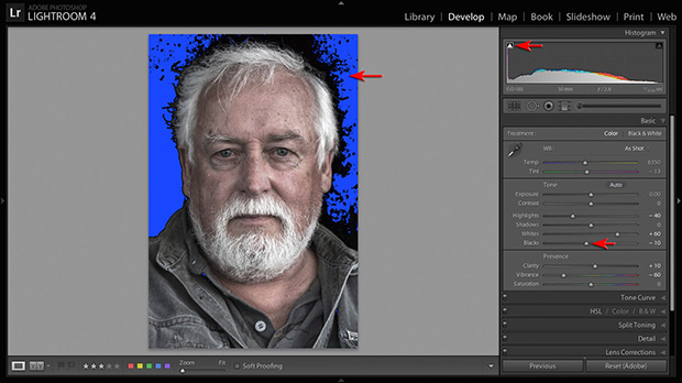
We can expand the contrast of this image by darkening the shadows with the Blacks slider. Normally I am a big fan of holding on to rich detail, even in the darkest shadows, but in this image it is
fine if we lose some detail in the background. Click on the ‘Show Shadow Clipping’ triangle above the histogram. This will help you see which areas of the image are being clipped (losing detail). Ideally the only tones that should clip to black here are the pupils of each eye. Move the Blacks slider left to a setting of around -10. Click on the clipping triangle again to switch off the clipping display.
07 SPOT REMOVAL
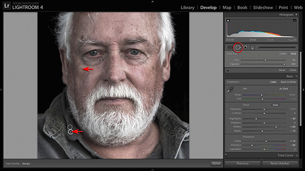
As we expand the tonal range of the image some blemishes may be exaggerated. We can either remove these, or reduce their visibility. Click the Spot Removal tool below the Histogram, click on the Heal option and adjust the Size of the tool cursor to a size just larger than the blemishes you intend to remove. Lower the Opacity slider if you do not wish to remove these blemishes altogether. Click on each blemish in turn and drag the source circle associated with each ‘fix’ to an alternate position if the healing action is unsatisfactory. In this tutorial I have made a couple of adjustments around the eyes and removed some distracting stitching on the sitter’s right lapel.
08 BRIGHT EYES
The eyes are the most important part of any portrait. In this image it will help to render the eyes a little brighter. Click on the Adjustment brush icon below the histogram and move the Exposure slider to a value of +0.50. Make sure the Density and Flow sliders are set to 100% and the Auto Mask option is deselected. Paint over the iris and whites of each eye.
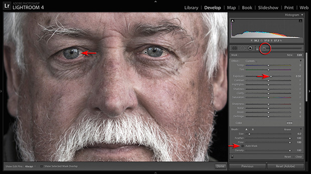
09 SHARPEN
In this step we will sharpen the image so that every detail pops. Click on the Detail panel to open it, zoom in to 1:1 view and raise the Amount slider to +90. You can keep the smoother tones noise free by raising the Masking slider to +60. By holding the Alt key (Option, Mac) as you move the slider, you can see which parts of the image will be affected by the sharpening adjustment (areas that are black will not be sharpened).
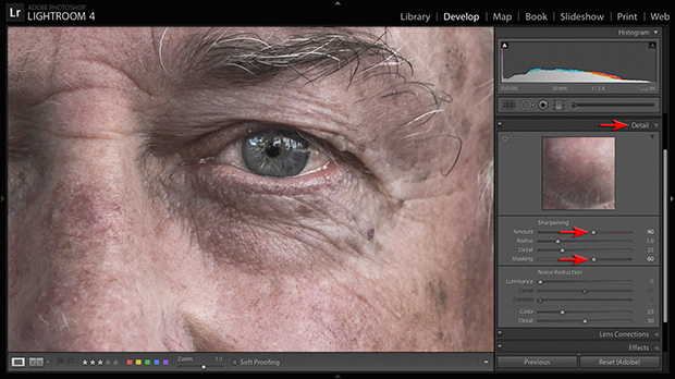
10 GRADUATED FILTER
In an ideal world, my partner would have either held a reflector on one side of Alan’s face or a black cutter on the other (if she had three arms!). This would have provided the portrait with some subtle directional light. We can, however, emulate this subtle directional light using a Graduated Filter. Click on the Filter icon below the histogram and move the Exposure slider down to a value of -0.25. Drag a short gradient across the face from left to right. You can fine-tune the effect by playing with the Contrast and Saturation sliders after the initial filter has been put in place.
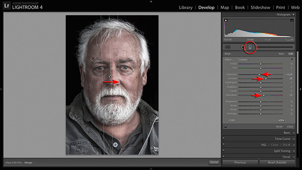
11 IMAGE BORDER
The final step is to add a thin white border around the image. Click on the Effects panel and set the Post-Crop Vignetting style to Color Priority. Raise the Amount slider to +100 and lower the Midpoint and Roundness sliders to -100. Adjust the value of the Midpoint slider to control the thickness of the border. Switch the Amount slider to -100 if you prefer a black border. If you are comfortable with the sliders in the Basic panel and accustomed to the Graduated Filters and Adjustment Brush this whole project can be completed in a few minutes. The remarkable thing is how with just a few small changes we start to pay much more attention to Alan, who now seems to be looking out at us as we, in turn, look in at him.


