Lightroom tips for wildlife photographers (Part one)
The digital darkroom isn’t the natural habitat of keen wildlife photographers.
We’d rather be in the fresh air than in front of a computer screen, handling a camera rather than a keyboard.
Yet post-processing is a vital part of the creative process, whether you’re an old-school advocate of wildlife photography as documentary, or prefer a more interpretative, expressive approach to your nature images.
Clever editing can really make your subject sing while retaining the essential truthfulness of what you observed. And with a little more artistic licence you can deepen the drama and magnify the mood, to make your work stand out from the crowd.
We believe in getting our images right in camera, rather than relying on post-processing to salvage mistakes. It saves time, preserves authenticity, and maximises image quality. For us, the mantra ‘less is more’ is the key to editing, and we share a pet-hate of over-processed images.
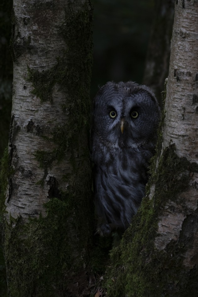
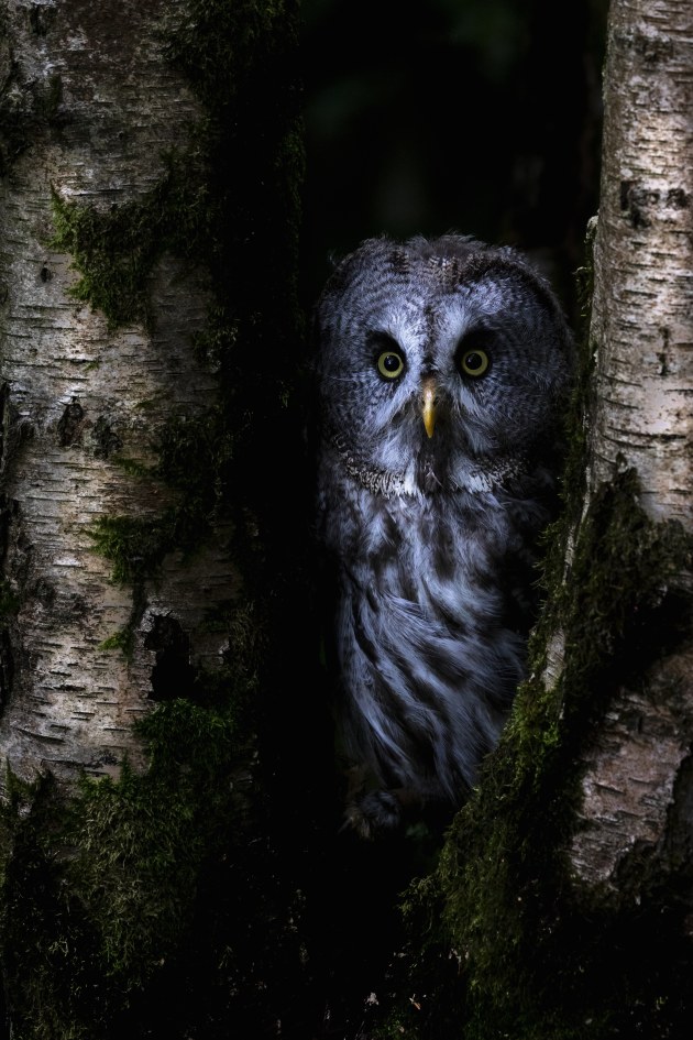
Excessive saturation, over-sharpening, unnatural colours; these all are great ways to kill an image, to make nature unnatural. Our post-processing is predominantly about image correction and subtle enhancement, our goal to achieve the vision we had at the point of capture.
We use Lightroom Classic for the bulk of our post-processing, Photoshop for dust-spotting and for some more sophisticated work with layers when required.
Every photographer has their own post-processing workflow and we’re not claiming ours is best, just explaining what works for us. Post-processing is part science, part art. There’s always room to freestyle, to experiment and have fun.
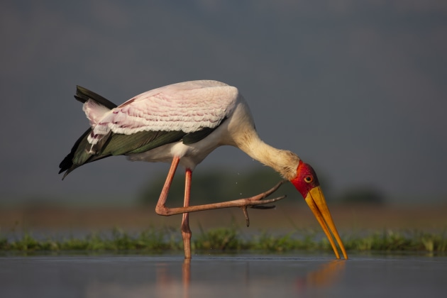
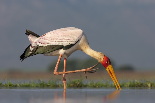
Import and edit: the first cut is the deepest
Fresh from a shoot and eager to start work on those special shots you hope you’ve captured, it’s tempting to dive straight in, cherry pick a few strong ones, and start processing. But accidents happen, so before we do any image manipulation, making back-ups is a vital first step.
Our uncut RAW files are copied to two separate devices before we import them to Lightroom: one set to the PC where they will be processed, and a back-up to an external hard drive.
When importing files into Lightroom we always select the option in File Handling to build 1:1 previews. This takes a little more time initially, but means we then have the highest quality previews available for decision-making.
Once imported, we’ll rename the folder in Navigator (right click on it > Rename) to something that means something to us (‘Zimanga game drive 1’, for example). If we’ve had a productive shoot and have a lot of images in the folder, we’ll often create sub-folders (right click > Create Folders Inside…), perhaps for different species, name these folders accordingly, and drag in the relevant images from the master folder.
We find it’s easier to then choose keepers and delete stuff when comparing like with like.
Now it’s time to sort the wheat from the chaff. We’ll first go through a folder, in the Library module, with large thumbnails, deleting any obvious no-hopers (Backspace > Delete from disk).
These are images that are fundamentally and irreversibly flawed, technically or aesthetically – out-of-focus, badly exposed, animals blinking or with rubbish expressions or awkward poses, etc. There are usually lots of these!
Then on a second pass we’ll spend more time comparing and selecting from similars, looking for the small differences that can make or break an image, such as pricked ears, alert expressions or a dynamic body or wing shape.
Some photographers like to use ratings to subdivide their keepers, for example on a scale of 1 to 5, but we’re more binary in our selection – an image is either good enough or it’s not.
It’s important at this stage to remember that even the best images can look flat and uninteresting as RAW files. You need to see the potential in the image, something that gets easier with experience.
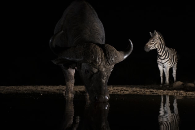
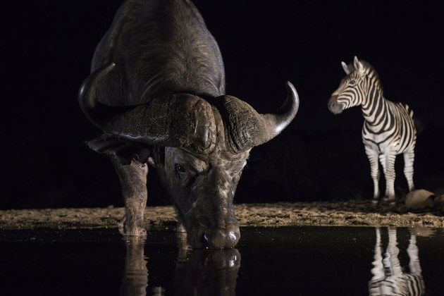
Now we’re down to a manageable selection it’s time to start processing. We’ll probably still have a few similars, making a final decision on which one to keep once we’ve ‘Lightroomed’ them.
And we’ll probably have some keepers we’ll delete after living with them for a few days – it’s not always easy being objective about an image you had high hopes for, but didn’t quite work.
Developing the image
One of the beauties of Lightroom is that you can flit back and forward between sliders in the Develop module, the order in which you do things doesn’t affect the outcome. We generally stick to the following routine, but we’ll often jump back and forwards, tweaking sliders that we’ve already adjusted.
Bear in mind not all images require a boots-and-all approach. We’ll often apply only a fraction of the tools at our disposal to an individual shot where that’s all it needs.
Lens profile
Before we start with sliders we go to Lens Corrections, click the Profiles tab, and make sure that Remove Chromatic Aberration and Enable Profile Corrections are ticked. This is especially important with images shot with wide angle lenses, where colour fringing is often seen in the corners, for example, on tree branches.
Profile correction will largely remove barrel and pincushion distortion. Occasionally we’ll deselect it if we like the distorted effect of an ultra-wide close-up, say for a looming elephant bull.
Lens Correction also deals with unwanted vignetting on wide angle shots, but if you like the vignetting you can click on the manual tab and add it to taste.
Cropping
We like to crop early in the process, so the histogram information is relevant to the final image content. A very bright sky, for example, will strongly affect the histogram curve, so if we plan to crop it out, it’s best to do so first.
With high megapixel sensors it’s possible to crop heavily and still have a useable image, especially if it’s only going to be used on a web page or social media. It all depends on the end use, for example, photo agencies and competitions demand restraint: reducing an original image by more than 20 per cent is likely to be unacceptable.
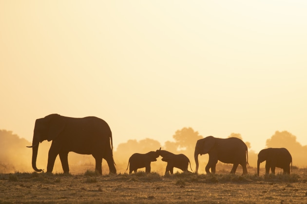
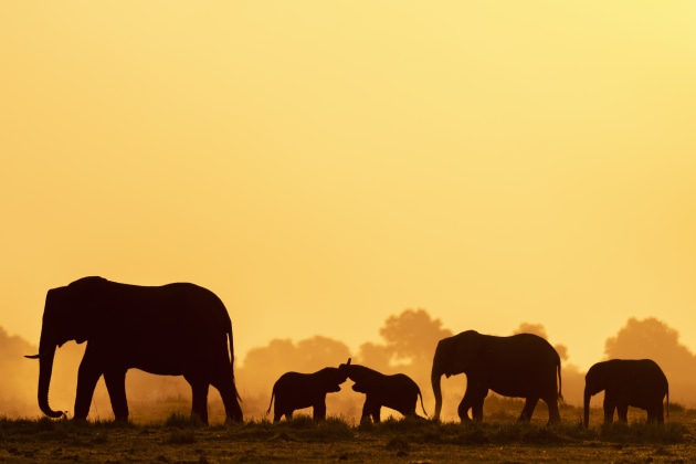
If you want a high-quality image, heavy cropping is no substitute for not getting close enough to your subject, or not having e big enough lens. We crop lightly, just to finesse the composition. Make sure you leave enough space around your subject, so it doesn’t look squashed into the frame, and if it's moving has space to move into.
Not every animal portrait looks good filling the frame: with a tiny subject such as a fairy wren, for example, it’s often better to keep it quite small in the frame, to emphasise its diminutive size.
Look out for part two next week, where we delve further into our workflow.
About the authors: Ann & Steve Toon are a UK-based, husband and wife team of award-winning, professional photographers with a specialist interest in the wildlife and wild places of southern Africa where they spend several months each year photographing and running photographic safaris.
Their work is published in a wide range of magazines and national newspapers, both in the UK and abroad, and they are represented by several leading photographic libraries. They've also written three books, two on wildlife photography and one on rhinos. You can see more of their work on their website at toonwildlife.com.


