Photo tip of the week: Composition masterclass with Drew Hopper
If you want to take amazing photographs you need to master composition. Pro photographer Drew Hopper shares his best tips to help you frame your images for maximum impact.
Every great photograph consists of three key elements - composition, lighting and of course 'the moment.' Look at any amazing image and you’ll notice these elements. Next time you're looking at a great shot, ask yourself which part of the image caught your attention - more often than not, it will be the compositional structure that sets the scene. A poorly composed photo can make a fantastic subject dull, but a well-executed composition has the potential to turn an ordinary situation into something extraordinary. This is why composition is critical and should be paramount for every photo you take.
Let’s face it; people will not be drawn to our photos if there is nothing of interest to grab their attention. It's why I firmly believe photographers can improve their work by thoughtfully constructing images that make sense.
There are just a few imperative things to understand when discussing the various principles and importance of composition. To properly grasp composition and capture powerful and meaningful photographs, we should understand how the human mind works.
01 The basics
Basically, “composition” describes the placement of relative elements in a photograph. A strongly composed image will lead the viewer’s eye towards the main parts of an image, usually in a specific order. There’s a number of factors that can affect the way an image is visualised and how people perceive your work. Framing, positioning, perspective, and focal length are just a few things that can make all the difference.
There is no short way to overstate the significance of composition in any art form. The art to composing a great shot over a good shot requires thoughtful arrangement of particular elements that best portray the photographer’s vision. This can be done by physically rearranging elements within a scene, i.e. portrait or landscape photography, where the photographer might ask the subject to reposition, or they might move a stick from a scene to clean up the space.
Another approach is by visualising and anticipating a moment before it unfolds; a perfect example of anticipating composition is street photography. Street photographers must think and act quickly to keep up with the fast moving pace of an ever changing moving world. It’s often not physically possible to move or ask your subject to change position, therefore you’ll need to anticipate the moment and be ready to click the shutter when the moment unfolds. This is called the ‘fleeting moment’, something to remember when working in fast moving environments.


02 Reverse painting
Photography and painting as art forms have a lot in common. Just as paintings represent images through the artist’s imagination, a photograph can also be represented through the imagination of the photographer by pre-visualising an image beforehand.
The difference between photography and painting is that painters normally start with a blank canvas and add elements with a paintbrush. Often, photographers work in reverse, starting with a ‘full canvas’ and selectively eliminating the distracting or unwanted elements from the picture. It has been said that paintings are less realistic than photographs, which is habitually true because a photo is usually something that exists. However a poorly composed photograph can also become unrealistic and misleading. Both art forms require an attentive eye for detail and compositional value.


03 Visual tension
Understanding visual tension and how to leverage it in your pictures, you should first consider how the human brain responds to visual information. Think of your mind as a visual archive that processes information and paints a picture in your head of how you perceive the world. When we view an image for the first time our brain instinctively processes this information to show us the bigger picture. To understand this, it’s important to note that without our brain it wouldn’t be possible to capture what our eyes perceive. Or as you may have heard before, 'what our mind does not know, our eyes cannot see.'
As we live in a three-dimensional world, our brain must process information in order to transfer it onto our eyes. This is because a photo is two-dimensional and it's all our eyes will distinguish. When we view an image our mind automatically selects the vital features and passes it onto our vision. The brain is also responsible for how we feel when we view an image. Without it we can’t be attracted or emotionally moved by a photograph.
Our brains are limited to how much material we can absorb at a single time. In practice, it doesn’t have to be obvious when trying to get your message across. You could be as subtle as you wish, just as long as you entice your viewer’s attention towards the core aspects. Often, it’s possible to derive a whole understanding from the small details and assign meaning to what an image represents without revelling the entire story. If you engage your viewer’s minds in a consequential way than you’ve successfully done your job. If they divert their attention away from the vital parts then it’s likely they’ll lose interest and move on. Adding tension to your pictures can prompt the attentiveness of your viewer’s brain to spend more time studying the image. The key is finding the right balance. With the right amount of detail your audience will recognise that there’s meaning to the picture.

04 Exclude the extraneous
Composition should never complicate the facts. All it takes is some practice to train your eye to identify the various principles of composition. Once you familiarise yourself with the components, you will begin noticing patterns that work for your shooting style. An essential part of the process for capturing powerful and meaningful images is to exclude any irrelevant details. Every shot we take is a frame; this is why it’s good practice to be selective in terms of what we fill our frame with. Of course, the story or narrative will vary depending on how we choose to portray our subject, but there are some basic ‘rules’ or guidelines to consider. For example, you may want to leave your image open to interpretation. If so, you’ll likely eliminate certain parts of the scene, allowing the viewer to put the pieces together.
Another way to compose is by framing within another frame. This can help draw attention to the main part of an image. A strongly composed photo will typically be constructed with some kind of thought or meaning guiding the viewer’s eye to flow naturally, or organically through the entire frame, rather than being forced. When you include only the necessary pieces, your narrative will intensify, making it easier and quicker to communicate what it is you want to say.

05 Relative distance
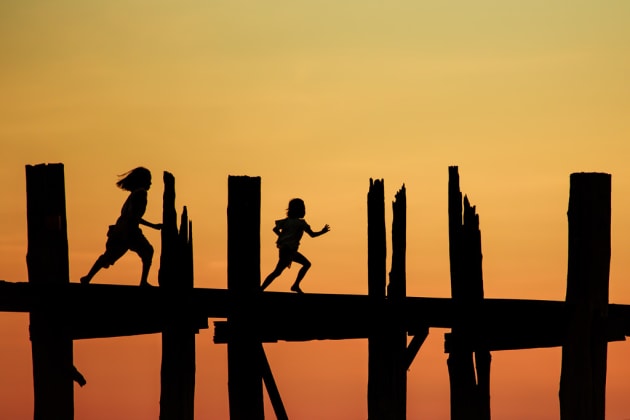
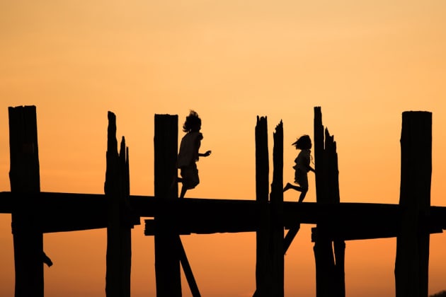
Relative distance when talking about composition usually refers to the distance between your subject(s) and the rest of the objects in the frame. This is very similar to adding tension. A basic rule is to avoid overlapping your subjects, as it often overcomplicates the message. For example, if two people were walking in opposite directions it would more visually engaging to avoid taking the shot when your subjects intersect. Keeping an eye on the relative distance between your subjects, the foreground and background will aid you in how you compose your shot. You obviously don’t want your subjects to overlap, but you also don’t want any distractions in the background crisscrossing on your main focal point. A good method is to frame your background first and wait for the right moment to take the shot when everything falls into place. It takes time, but it will show that you’ve put some thought into your shot.
06 Fill the frame
While negative space can be used effectively to create powerful photos, there’s an well-known saying by a famous photographer, Robert Capa, who once said, “if your pictures aren’t good enough, you’re not close enough.” Robert wasn’t referring to sticking a telephoto lens on his camera and zooming in; he means physically moving closer to the subject and become more immersed in the moment. This approach can help with not including too much extraneous detail, as the framing and focus will be solely on the subject. Filling the frame makes it obvious in showing your intended objective, which helps carry your message across from the moment your audience view the photograph.
When we fill the frame with the subject up close and personal, the whole dynamic is amplified making for a more dramatic shot. For example, a close up portrait is much more intimate than a full body portrait, as it immediately connects the viewer’s eyes with your subjects eyes. When shooting street photography it’s also good to get in nice and close with a wide angle to give the viewer a sense of being there in the scene. Try finding the contrast between the subject and the background to give your images more impact.
It’s also important to mention that filling the frame can become problematic if it’s not accurately executed. An example of this would be missing vital parts to the narrative by cropping off critical elements. The solution is to take a few shots, and move back and forth to see what works best. If you have the time, it takes very little energy to use your feet. Avoid using a zoom lens, as this will make you lazy. A nice fast prime lens is your best friend.

07 Avoid cropping
This may be a personal preference of mine, but I try to avoid cropping my images in post. I find greater satisfaction in perfecting the composition in camera. Not only does this save time when it comes to post-processing on the computer, it also makes me more observant when composing my shots. Now, this may not suit everyone and will vary depending what you shoot, but I find it a good to practice to perfect composition without relying on cropping.

08 Patterns and repetition
Patterns are aesthetically pleasing when we look at photos, but the best is when the pattern is interrupted or broken. This may seem mundane in everyday life, however when we start thinking in terms of composition it can really give your images impact. Think of patterns as a photographs ‘rhythm’, they give the structure harmony. When we start experimenting with different repetitions, lines, patterns, and colours, our images come to life.
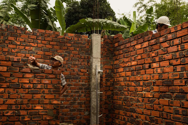
There are two ways you can use repetition in photography. You can either emphasise it or break it completely. Filling your frame with repetitive patterns will draw your eye into the shot. A good rule is to focus as close as possible, perhaps zooming in on the detailed area so that the pattern resumes its repetition throughout the entire frame. This also adds depth and complexity. For example, I've used the lines and textures of a brick wall to add repetition. This made the resulting image more visual, giving it a jigsaw puzzle feel.
When we start breaking patterns we increase the tension within an image. This can be a great way of focusing attention on a specific element. An example could be a straight line that suddenly changes directions and directs your eye to the main subject or focal point. Positioning your subject within an attention-grabbing pattern can aid in stimulating your viewer’s attention and encourage them to look deeper into an image.


